Color Grading for Beginners: A Quick 101 Guide
Color grading sounds more complicated than it is. Under all the jargon, it comes down to a handful of sliders and one question: does this shot look the way you want it to?
This guide keeps it simple. No color theory lecture and no complicated scopes.
What Is Color Grading?
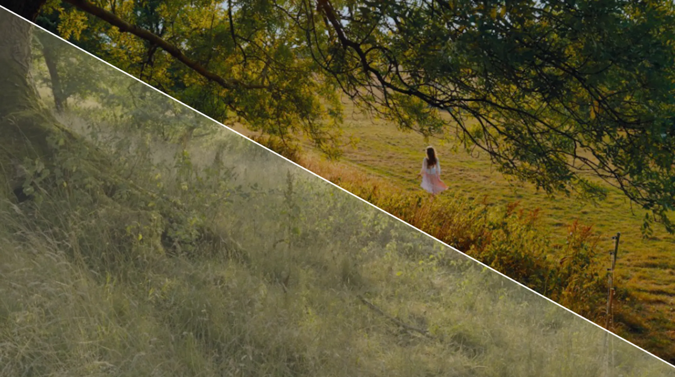
Color grading is the process of adjusting the color, brightness and contrast of a video to control how it looks and feels.
Every camera makes choices for you when it records. Grading is where you take those choices back. Sometimes that means rescuing a shot that came out too dark or too blue. Sometimes it means giving a whole video a warm, nostalgic feel or a cool, moody one.
If you have ever put a filter on a photo, you have already done a simple version of it. Video grading works on the same idea, with a lot more control over each part of the image.
Color Correction vs. Color Grading
Color correction fixes problems. Color grading creates a style.
| Color Correction | Color Grading | |
|---|---|---|
| Goal | Make the shot look accurate and natural | Give the shot a mood or a look |
| Typical changes | Exposure, white balance, matching shots to each other | Warmer or cooler tones, faded blacks, stylized colors |
| The question it answers | Does this look right? | Does this feel right? |
In practice the line is blurry, and most people say “color grading” for both. That is fine. What helps is knowing which job you are doing at any moment. It is surprisingly easy to spend ten minutes building a moody look on a shot whose real problem was a blue cast.
The Five Controls That Do Most of the Work
Grading apps are full of panels and sliders, but five controls cover the bulk of what a beginner needs.
There is no fixed order you have to follow. Look at each one, decide whether the shot needs it, and move on.
Exposure
Exposure controls the overall brightness of the image. If a shot looks too dark or too bright as a whole, this is the slider to reach for. Keep in mind that brightening a very dark shot also brightens the noise in it, so there is a limit to how much exposure can be rescued afterwards.
Contrast
Contrast is the difference between the darkest and brightest parts of the image. More contrast makes footage look punchier. Less makes it softer and flatter. Push it too far and you lose detail at both ends: shadows turn into solid black and bright areas turn into solid white.
White Balance
White balance decides whether white objects actually look white. Light has a color temperature, measured in Kelvin. Daylight sits around 5600K, while indoor tungsten bulbs sit around 3200K and look noticeably more orange on camera.
If your footage has an orange or blue cast it should not have, the temperature slider fixes it. Find something in the shot that should be neutral, like a white wall or a grey shirt, and adjust until it looks neutral. The tint slider next to it handles the green or magenta shift that some artificial lights add.
Saturation and Vibrance
Saturation controls how intense the colors are. Turning it up makes every color stronger by the same amount. Many apps, including Premiere Pro and Final Cut Pro, also have a vibrance control, which boosts muted colors more than the ones that are already strong. That makes vibrance the gentler option when there are people in the shot.
Highlights and Shadows
These sliders work on just the brightest or just the darkest parts of the image. Pulling highlights down can bring back detail in a bright sky, as long as it was not clipped when you recorded. Lifting shadows can reveal what is hiding in a dark corner. They are the softest way to fix a shot that is mostly fine but too harsh in one area.
Keep an Eye on Skin Tones
Skin tones deserve their own check.
People of every complexion have skin that sits in a surprisingly narrow range of hues. So when a face looks too orange, too pink or slightly green, that usually points to a color problem in the footage, not the person’s natural skin.
White balance and saturation are the usual places to look. Adjust in small steps and keep your eyes on the face rather than the whole frame.
Pro tip: Create a mask for the skin tones. That way you can dial in the color of the skin without changing the rest of the frame.
Your Screen Is Part of the Grade
You can only grade what you can see, and every screen shows color a little differently.
On iPhone, iPad and Mac, two features change your display’s color on purpose. True Tone adjusts the color and intensity of the screen to match the light around you. Night Shift moves the display toward warmer colors. Both are pleasant for everyday use, and both shift the colors you are trying to judge. Turn them off before you start grading and back on when you are done.
Brightness plays a part too, so keep it at the same moderate level every time you grade. And before you post, look at the finished video on a second device. If it holds up on your phone and your laptop, you are in good shape.
Keeping Shots Consistent
A video can be made of great individual shots and still feel off if they do not match.
Light changes as the sun moves, cameras adjust between takes, and two angles of the same scene can come out with slightly different color. Cut those shots together and the jump shows.
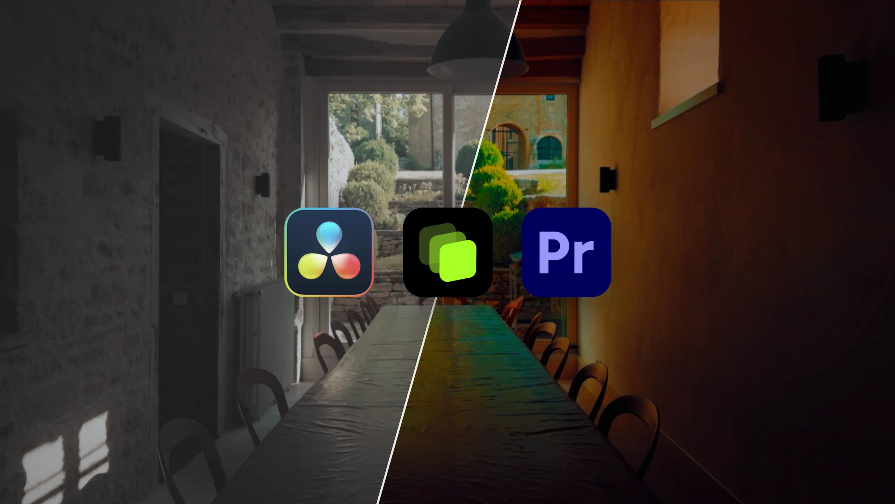
The simple fix: grade one shot until you like it, then copy that grade onto the other shots from the same scene. DaVinci Resolve, Premiere Pro and Final Cut Pro all let you copy a grade from one clip and paste it onto others. From there, make small tweaks wherever a shot does not quite match.
Where LUTs Fit In
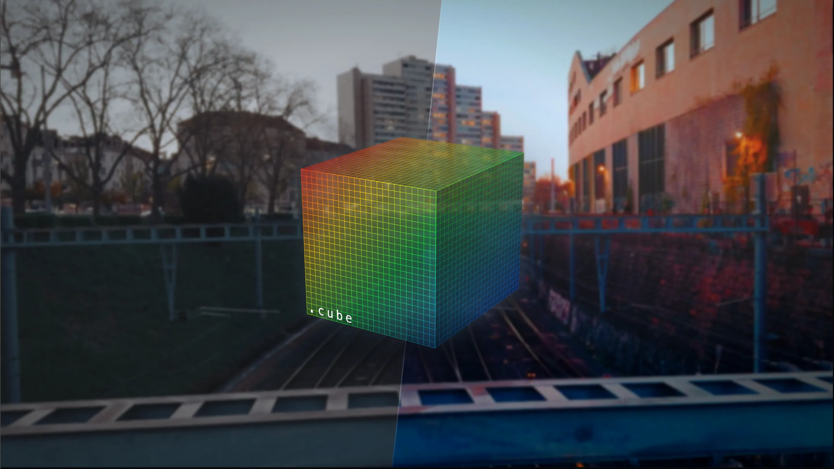
A LUT applies a whole set of color adjustments in one step.
Most of the time it is a starting point that you fine-tune with the five controls above. Sometimes, when the look suits the footage, one click is the whole grade. How LUTs work and how to apply one in each app have their own guides:
- What Is a LUT explains what a LUT does to your image and why conversion LUTs and creative LUTs are not the same thing
- How to Use LUTs walks through loading one in DaVinci Resolve, Premiere Pro and LUT Studio
Four Beginner Mistakes to Avoid
- Pushing everything too far. Each extra bit of saturation or contrast can look like an improvement in the moment, which is how a grade ends up overcooked. If you are unsure, pull your strongest adjustments back a little and compare.
- Copying a look that does not fit the footage. A look built for a sunny beach rarely suits a dim interior. When you borrow a style from another video, pay attention to the light it was shot in, not just its colors.
- Fixing one color by changing the whole image. If one person looks too red, lowering the overall saturation drains color from everything else too. Tools that target a single color range, like the HSL controls in Premiere Pro or the qualifier in DaVinci Resolve, let you adjust just that part.
- Forgetting where the video will be watched. A grade that looks great on a large monitor can feel too dark on a phone in daylight. If most of your audience watches on phones, check the final version on a phone.
Try It on Your Own Footage
The fastest way to learn color grading is to grade something. Pick one clip, go through the five controls, and see how far small changes take you. LUT Studio lets you apply a look, dial its intensity to taste, and compare before and after on your iPhone at full resolution.
Download LUT Studio for free on the App Store.
Start Grading - Free on the App StoreFAQ
What is color grading in simple terms?
Color grading is adjusting the color, brightness and contrast of a video to control how it looks and feels. It covers both fixing problems, like a blue cast, and creating a style, like a warm or moody look.
What is the difference between color correction and color grading?
Color correction makes footage look accurate and natural, for example by fixing exposure or white balance. Color grading gives footage a creative look or mood. Many people use “color grading” to mean both.
Do you need to shoot in LOG to color grade?
No. Standard video can be graded too. LOG footage records more dynamic range and gives you more room to adjust, but it also has to be graded before it looks normal. Standard footage works fine for learning the basics. If you shoot on a Pro iPhone, our guide to shooting Apple Log covers the LOG side.
Is there free software for color grading?
Yes. DaVinci Resolve has a free version for Windows, Mac and Linux that includes its Color page, with some advanced features reserved for the paid Studio version. On iPhone, apps like LUT Studio let you grade directly on your phone.
Why does my video look different on other screens?
Every screen displays color slightly differently, and features like True Tone and Night Shift on Apple devices change display color on purpose. Turn those off while grading and check your finished video on a second device before posting.
Can you color grade on an iPhone?
Yes. Even the built-in Photos app lets you adjust exposure, contrast, saturation and warmth on video. Dedicated apps like LUT Studio add LUTs, intensity control and before and after comparison at full resolution.